The report, Blueprint for a Public Health and Safety Approach to Drug Policy, by the Drug Policy Alliance and The New York Academy of Medicine provides a comprehensive set of recommendations for fixing a broken drug policy that is a “bifurcation between two different and often contradictory approaches – one which treats drug use as a crime and the other view, as a chronic relapsing health or behavioral condition.”
Anyone who has spent time working in human services knows that multiple programs (whether offered through community groups, nonprofits, churches, or government agencies at the local, state, and federal level), own a piece of the puzzle when it comes to helping and healing people and families. In the case of substance abuse treatment, there’s a myriad of actors in health/mental health, schools, substance abuse services, law enforcement, corrections, and departments of children and families who all need to be coordinating and working together. However, as the Blueprint highlights, this does not always happen. Rather, “without a united framework and better coordination, these actors and agencies often work at cross-purposes” (Blueprint Report, pg. 4). The themes of coordination, overlapping, and cross-purposes appear throughout the report, and these are what I highlight in the discussion of data visualization here.
Provoking Change: Your Data Can Tell a Story
Data visualizations can tell a clear concise story about why an issue is important and why change is needed. So, they are ideal tools for fostering greater awareness and supporting advocacy efforts.
Data visualizations are often associated with their popular counterparts, information graphics (aka infographics). Although both allow you to use and transform your data into a compelling presentation or powerful story, there is a key difference between the two. While data visualizations take complex sets of data and display them in a graphical interface, like a chart or map, so users can gain insight into patterns and trends, infographics use data visualizations in concert with text and other tactics to tell a story, make a point or communicate a concept (“Data Visualization and Infographics: Using Data to Tell Your Story”).
Visualizations are especially effective for data advocacy because they:
- Make your message more compelling: Let’s face it, visualizations are simply much better at stimulating thought and conversation than more traditional textual or numerical data.
- Allow you to reach a wider and more diverse audience: The reason for this is that visualizations allow you to convey complex data and abstract information in an easily digestible and shareable formats.
- Visualize information, systems, networks and flows which can be valuable for highlighting social problems and need for policy changes.
- Illustrate timelines and relationships that can help readers put the dots together in understanding a problem (“Data Visualization and Infographics: Using Data to Tell Your Story”).
Visualizing New York Drug Policy
This next section outlines step-by-step instructions to create your own data visualization. I searched NYC Open Data and Open Data NY Gov for the best data set that would help me highlight the idea of overlapping human services agencies that work on substance abuse issues in New York State. The best data set I found was one which provided information on Local Mental Health Program in New York State, broken by county and program subcategory.
Because of the geographic nature of this data, I opted to create a heat map. Because I was also interested seeing the distribution of the types of substance abuse mental health programs in New York according to county, I found a histogram to be useful as well. I then selected two free and easy-to-use data visualizations tools: Many Eyes and Tableau Public.
This brings me to the first lesson in creating data visualizations:
(1) Don’t be seduced by the exciting and cool visualization tools: In creating visualizations for advocacy and social change, it’s critical to keep in mind your objective and to avoid visualizations which just offer eye-candy. You want the reader to be attracted to your message, not your methodology or the cool visual tools you used. So, ask yourself if you want your data to provide (a) description, (b) exploration, (c) tabulation, or (d) decoration (see Tufte’s “The Visual Display of Quantitative Information.” ) There is a lot you can accomplish visually with basic free tools such as the two that I used. However, for a full list of all data visualizations tool available visit Bamboo DiRT.
(2) Prep your data: Every great visualization begins with a coherent and well-organized data set. As a result, it’s important to clean your data and only leave the most essential variables organized in the best possible format to reveal the main relationships that you want to highlight between your variables.
Two free tools which can help you clean and prep your data for visualization are:
For my data set of Local Mental Health Program in New York State, I filtered the data according to those that provided substance abuse counseling and then I created a frequency distribution with a pivot table. Pivot tables (also called contingency tables and cross tabulation tables) are a powerful means of data visualization and data summarization. You can download my pivot table here if you would like to experiment with it.
Mental Health Program Sub-Categories
| Assertive Community Treatment | Care Coordination |
| Clinic Treatment | Comprehensive Psychiatric |
| Emergency | Continuing Day Treatment |
| Crisis Day Treatment | Education Forensics |
| General Hospital Psychiatric IP Unit | General Support |
| Intensive Psychiatric | Rehabilitation |
| Partial Hospitalization | Personalized Recovery-Oriented Services |
| Private Psychiatric Hospital | Residential Treatment Facility |
| Self-Help | State Psychiatric Hospital |
| Support Program | Treatment Program |
| Unlicensed Housing | Vocational |
Many Eyes provides information on how to format your data according to the visualization that you chose.
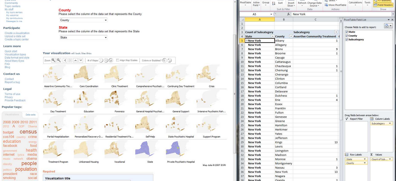
After creating a pivot table of my data which adds up the total number of program subcategories according to county in New York, I am then able to upload the data onto Many Eyes.

After uploading the data, I compared how the pivot data appears on Many Eyes versus my spreadsheet to ensure data accuracy.
To see the final interactive heat map designed on Many Eyes click on the image below:
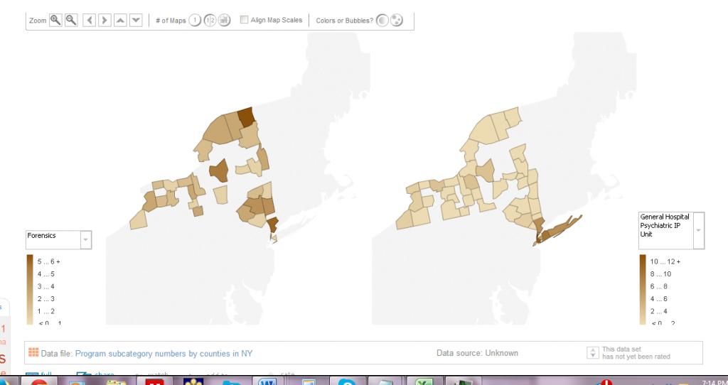
This heat map showcases the density of mental health programs that deal with substance abuse in New York State. The heat map is interactive because the key allows you to select different sub-program categories to see which counties have the most programs and which don’t.
(3) Ensure Content Focus: The best visualizations are transparent about the data used. As a result, in designing my interactive heat map, I also included drop down menus for people to see what types of substance abuse programs were available in which counties and which were not. As a result, I wanted to keep the focus on the content of the data and not necessarily on the very cool heat map that I just made!
(4) Reveal the data at several levels of detail, from a broad overview to the fine structure: Tableau Public offers much more customization features which allow you to showcase your data on many different levels.

Tableau dashboard features more options for organizing your data and highlighting specific trends geographically broadly or on a more granular level.
(5) Avoid Distorting the Data: A good visualization should always showcase the data honestly. As a result, things such as pie graphs and charts are frowned upon because they of their distortion of the data and lack of clarity. This is what’s often deemed as avoiding “chart junk” (Tufte).
For example, my pivot table histogram below does a better visual picture of highlighting consistencies and gaps in mental health services across program sub-categories and counties than the map using pie charts.

Pivot table histogram highlighting the distribution of each mental health program sub category by counties. As a result, this visual quickly shows you the overlaps as well as gap in services.
Now look at my same pivot table data but this time using pie charts rather than heat map or histogram. Although, somewhat visually appealing, the pie charts do not shows how the programs each make up a whole, thereby, disguising the potential problems of overlap.

Becoming a Data Visualization Expert: Final Tips and Resources
(6) Make it memorable: Studies have found that memorability alone can enhance the effectiveness of visualizations. A recent study, which is the most comprehensive study of visualizations to date, found that visualizations that were most memorable had:
- “Human recognizable objects”, these were images with photographs, body parts, and icons–things that people regularly encounter in their daily lives.
- Effective use of color, specifically, visualizations with more than six colors were much more memorable than those with only a few colors or a black-and-white gradient.
- Visual density, meaning that visuals that had a lot going on were more memorable than minimalist approaches.
For inspiration on data visualizations that promote advocacy and social change visit: