A powerful way to understand the effects of stop-and-frisk on the people of NYC is through data visualization. Data visualization provides scholars, activists and journalists with a set of tools to display data in a way that can be more easily and clearly communicated with a broad audience. In an era in which digital media is re-shaping scholarly communication, data visualization has became an important tool in teaching, research and activism.
Many data visualizations have been created to illustrate the effects of stop-and-frisk in New York City. For example, the folks at the Center for Constitutional Rights have created a map that shows which neighborhoods have been most affected by stop-and-frisk by charting the number of stops by precinct.
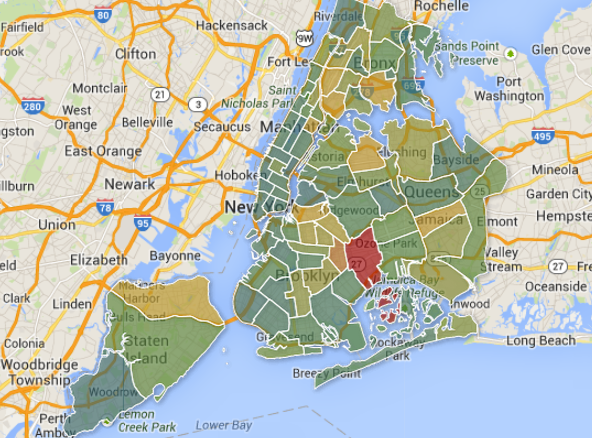
The borders of the map below represent NYPD precincts throughout New York City. Image from: Stopandfrisk.org
A journalism school class at Columbia University compiled stop-and-frisk data to produce a map with stops color-coded by race. The map powerfully illustrates how stop-and-frisk policing disproportionately impacts communities of color.
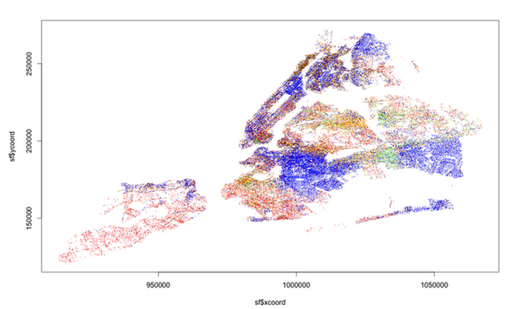
Stop and frisk data broken down by race (each dot represents a stop). The key to reading those dots is as follows: 1. black: blue; 2. black Hispanic: black; 3. white Hispanic: orange; 4. white: red; 5. Asian/Pacific Islander: green; 6. American Indian/Native Alaskan: yellow.
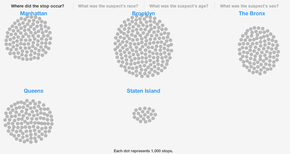
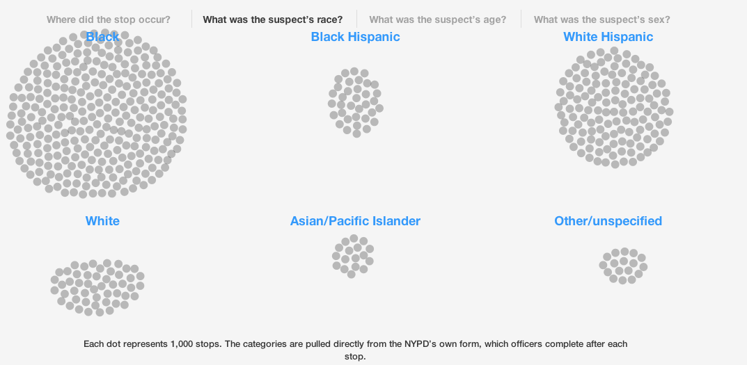
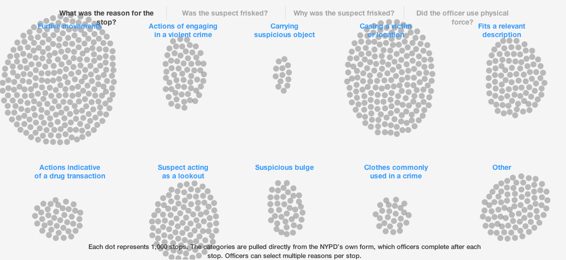
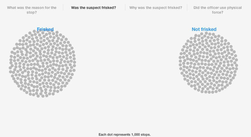
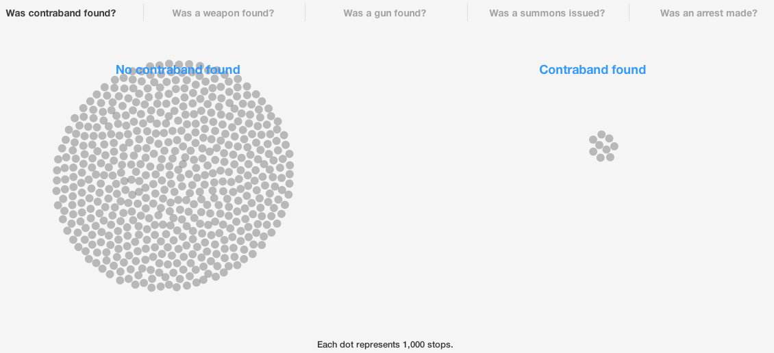
The online magazine BKLYNR, which features quality journalism about Brooklyn, has also used data visualization to focus attention on the issue of stop-and-frisk. In their piece, All The Stops they chart the “more than 530,000 stops that occurred in 2012, [to] reveal who is being stopped, why they’re being stopped, and what, if anything, is being found by the police as a result.” BLKYNR’s visualization of stop-and-frisk allows for a strong understanding of the volume and effects of this policing tactic and engages audiences through questions and answers such as:
Where did the stop occur?
What was the suspect’s race?
What was the reason for the stop?
Was the suspect frisked?
Was contrabound found?
Was an arrest made?

Take Action
Are you interested in making your own data visualization? There are many tools that journalists, academics, and activists can use. As a way to get started, take a look at this list of the Top 20 Data Visualization Tools.
* * *
This post is part of the Monthly Social Justice Topic Series on stop-and-frisk. If you have any questions, research that you would like to share related to Stop-and-Frisk or are interested in being interviewed for the series, please contact Morgane Richardson at justpublics365@gmail.com with the subject line, “Stop-and-Frisk Series.”