Category Archives: Data Visualization

Data Advocacy: Visualizations for Promoting Change

The report, Blueprint for a Public Health and Safety Approach to Drug Policy, by the Drug Policy Alliance and The New York Academy of Medicine provides a comprehensive set of recommendations for fixing a broken drug policy that is a “bifurcation between two different and often contradictory approaches – one which treats drug use as a crime and the other view, as a chronic relapsing health or behavioral condition.”

Anyone who has spent time working in human services knows that multiple programs (whether offered through community groups, nonprofits, churches, or government agencies at the local, state, and federal level), own a piece of the puzzle when it comes to helping and healing people and families. In the case of substance abuse treatment, there’s a myriad of actors in health/mental health, schools, substance abuse services, law enforcement, corrections, and departments of children and families who all need to be coordinating and working together. However, as the Blueprint highlights, this does not always happen. Rather, “without a united framework and better coordination, these actors and agencies often work at cross-purposes” (Blueprint Report, pg. 4). The themes of coordination, overlapping, and cross-purposes appear throughout the report, and these are what I highlight in the discussion of data visualization here.

Provoking Change: Your Data Can Tell a Story

Data visualizations can tell a clear concise story about why an issue is important and why change is needed. So, they are ideal tools for fostering greater awareness and supporting advocacy efforts.

Data visualizations are often associated with their popular counterparts, information graphics (aka infographics).  Although both allow you to use and transform your data into a compelling presentation or powerful story, there is a key difference between the two. While data visualizations take complex sets of data and display them in a graphical interface, like a chart or map, so users can gain insight into patterns and trends, infographics use data visualizations in concert with text and other tactics to tell a story, make a point or communicate a concept (“Data Visualization and Infographics: Using Data to Tell Your Story”).

Visualizations are especially effective for data advocacy because they:

  • Make your message more compelling: Let’s face it, visualizations are simply much better at stimulating thought and conversation than more traditional textual or numerical data.
  • Allow you to reach a wider and more diverse audience:  The reason for this is that visualizations allow you to convey complex data and abstract information in an easily digestible and shareable formats.
  • Visualize information, systems, networks and flows which can be valuable for highlighting social problems and need for policy changes.
  • Illustrate timelines and relationships that can help readers put the dots together in understanding a problem (“Data Visualization and Infographics: Using Data to Tell Your Story”).

Visualizing New York Drug Policy

This next section outlines step-by-step instructions to create your own data visualization. I searched NYC Open Data and Open Data NY Gov for the best data set that would help me highlight the idea of overlapping human services agencies that work on substance abuse issues in New York State. The best data set I found was one which provided information on Local Mental Health Program in New York State, broken by county and program subcategory.

Because of the geographic nature of this data, I opted to create a heat map.  Because I was also interested seeing the distribution of the types of substance abuse mental health programs in New York according to county, I found a histogram to be useful as well.  I then selected two free and easy-to-use data visualizations tools: Many Eyes and Tableau Public.

This brings me to the first lesson in creating data visualizations:

 (1) Don’t be seduced by the exciting and cool visualization tools: In creating visualizations for advocacy and social change, it’s critical to keep in mind your objective and to avoid visualizations which just offer eye-candy.   You want the reader to be attracted to your message, not your methodology or the cool visual tools you used.  So, ask yourself if you want your data to provide (a) description, (b) exploration, (c) tabulation, or (d) decoration (see Tufte’s “The Visual Display of Quantitative Information.” )   There is a lot you can accomplish visually with basic free tools such as the two that I used.  However, for a full list of all data visualizations tool available visit Bamboo DiRT.

(2) Prep your data: Every great visualization begins with a coherent and well-organized data set.  As a result, it’s important to clean your data and only leave the most essential variables organized in the best possible format to reveal the main relationships that you want to highlight between your variables.

Two free tools which can help you clean and prep  your data for visualization are:

For my data set of Local Mental Health Program in New York State, I filtered the data according to those that provided substance abuse counseling and then I created a frequency distribution with a pivot table.  Pivot tables (also called contingency tables and cross tabulation tables) are a powerful means of data visualization and data summarization.  You can download my pivot table here if you would like to experiment with it.

Mental Health Program Sub-Categories

Assertive Community Treatment Care Coordination
Clinic Treatment Comprehensive Psychiatric
Emergency Continuing Day Treatment
Crisis Day Treatment Education Forensics
General Hospital Psychiatric IP Unit General Support
Intensive Psychiatric Rehabilitation
Partial Hospitalization Personalized Recovery-Oriented Services
Private Psychiatric Hospital Residential Treatment Facility
Self-Help State Psychiatric Hospital
Support Program Treatment Program
Unlicensed Housing Vocational

Many Eyes provides information on how to format your data according to the visualization that you chose.

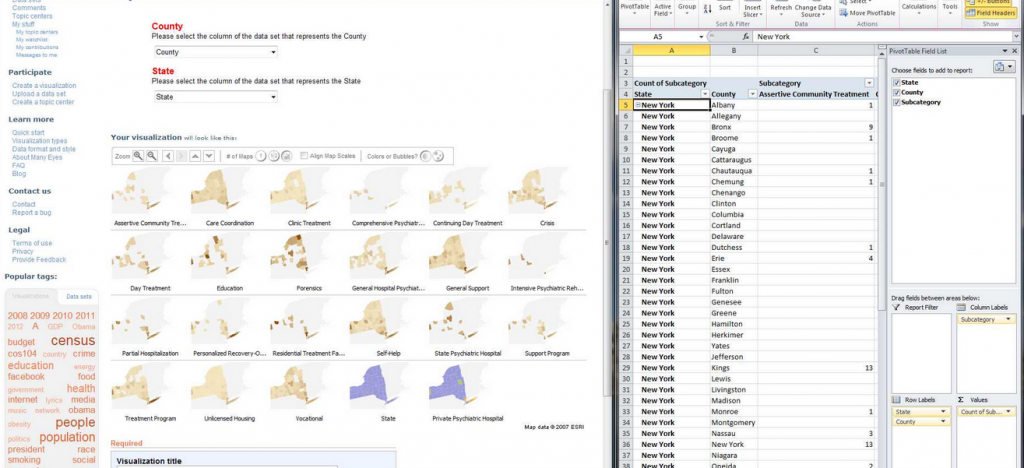
Pivot Table into Many Eyes

After creating a pivot table of my data which adds up the total number of program subcategories according to county in New York, I am then able to upload the data onto Many Eyes.

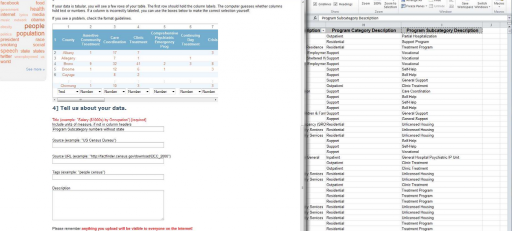
 finalizing pivot data

After uploading the data, I compared how the pivot data appears on Many Eyes versus my spreadsheet to ensure data accuracy.

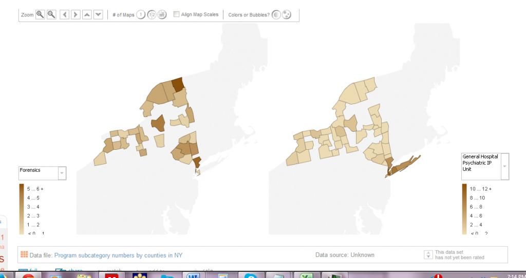
To see the final interactive heat map designed on Many Eyes click on the image below:

 Many Eyes Heat Map

 This heat map showcases the density of mental health programs that deal with substance abuse in New York State.  The heat map is interactive because the key allows you to select different sub-program categories to see which counties have the most programs and which don’t.  

(3) Ensure Content Focus: The best visualizations are transparent about the data used.  As a result, in designing my interactive heat map, I also included drop down menus for people to see what types of substance abuse programs were available in which counties and which were not.  As a result, I wanted to keep the focus on the content of the data and not necessarily on the very cool heat map that I just made!

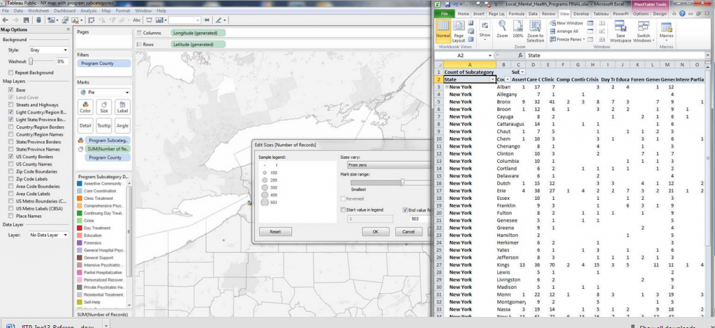
(4) Reveal the data at several levels of detail, from a broad overview to the fine structure:  Tableau Public offers much more customization features which allow you to showcase your data on many different levels.

Tableau dashboard

Tableau dashboard features more options for organizing your data and highlighting specific trends geographically broadly or on a more granular level.  

(5) Avoid Distorting the Data: A good visualization should always showcase the data honestly.  As a result, things such as pie graphs and charts are frowned upon because they of their distortion of the data and lack of clarity.  This is what’s often deemed as avoiding “chart junk” (Tufte).

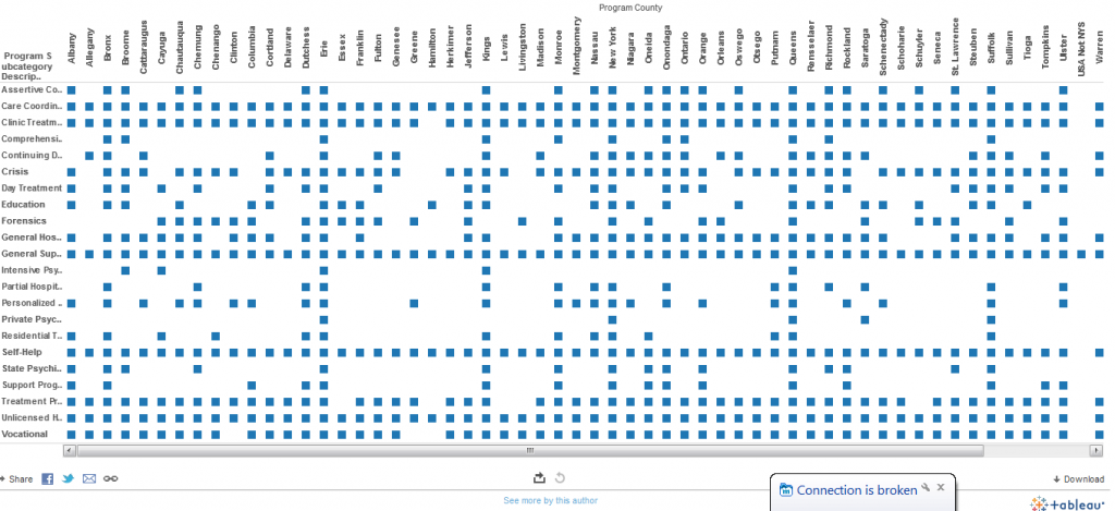
For example, my pivot table histogram below does a better visual picture of highlighting consistencies and gaps in mental health services across program sub-categories and counties than the map using pie charts.  

pivot table chart

Pivot table histogram highlighting the distribution of each mental health program sub category by counties.  As a result, this visual quickly shows you the overlaps as well as gap in services.

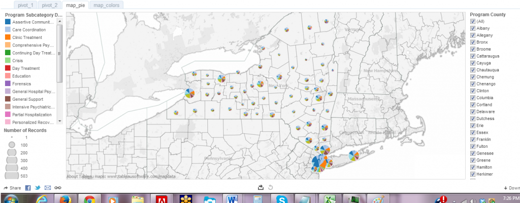
Now look at my same pivot table data but this time using pie charts rather than heat map or histogram.  Although, somewhat visually appealing, the pie charts do not shows how the programs each make up a whole, thereby, disguising the potential problems of overlap.

piegraphs

Becoming a Data Visualization Expert: Final Tips and Resources

 (6) Make it memorable:  Studies have found that memorability alone can enhance the effectiveness of visualizations.   A recent study, which is the most comprehensive study of visualizations to date, found that visualizations that were most memorable had:

  • Human recognizable objects”, these were images with photographs, body parts, and icons–things that people regularly encounter in their daily lives.
  • Effective use of color, specifically, visualizations with more than six colors were much more memorable than those with only a few colors or a black-and-white gradient.
  • Visual density, meaning that visuals that had a lot going on were more memorable than minimalist approaches.

For inspiration on data visualizations that promote advocacy and social change visit:

Visualizing The Effects of Stop and Frisk

A powerful way to understand the effects of stop-and-frisk on the people of NYC is through data visualization. Data visualization provides scholars, activists and journalists with a set of tools to display data in a way that can be more easily and clearly communicated with a broad audience. In an era in which digital media is re-shaping scholarly communication, data visualization has became an important tool in teaching, research and activism.

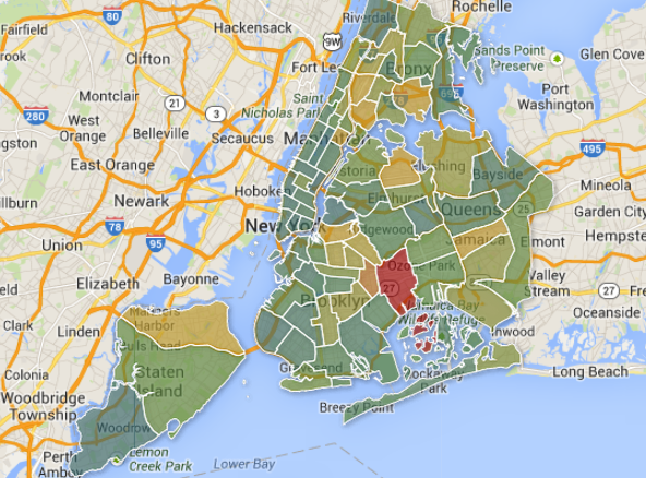
Many data visualizations have been created to illustrate the effects of stop-and-frisk in New York City.  For example, the folks at the Center for Constitutional Rights have created a map that shows which neighborhoods have been most affected by stop-and-frisk by charting the number of stops by precinct.

The borders of the map below represent NYPD precincts throughout New York City.

The borders of the map below represent NYPD precincts throughout New York City. Image from: Stopandfrisk.org

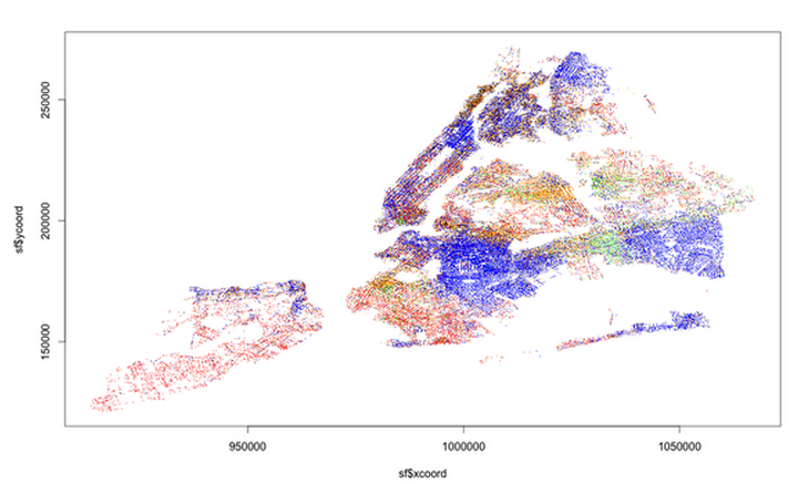
A journalism school class at Columbia University compiled stop-and-frisk data to produce a map with stops color-coded by race. The map powerfully illustrates how stop-and-frisk policing disproportionately impacts communities of color.  

Stop and frisk data broken down by race. The key to reading those dots is as follows: 1. black: blue; 2. black Hispanic: black; 3. white Hispanic: orange; 4. white: red; 5. Asian/Pacific Islander: green; 6. American Indian/Native Alaskan: yellow.

Stop and frisk data broken down by race (each dot represents a stop). The key to reading those dots is as follows: 1. black: blue; 2. black Hispanic: black; 3. white Hispanic: orange; 4. white: red; 5. Asian/Pacific Islander: green; 6. American Indian/Native Alaskan: yellow.

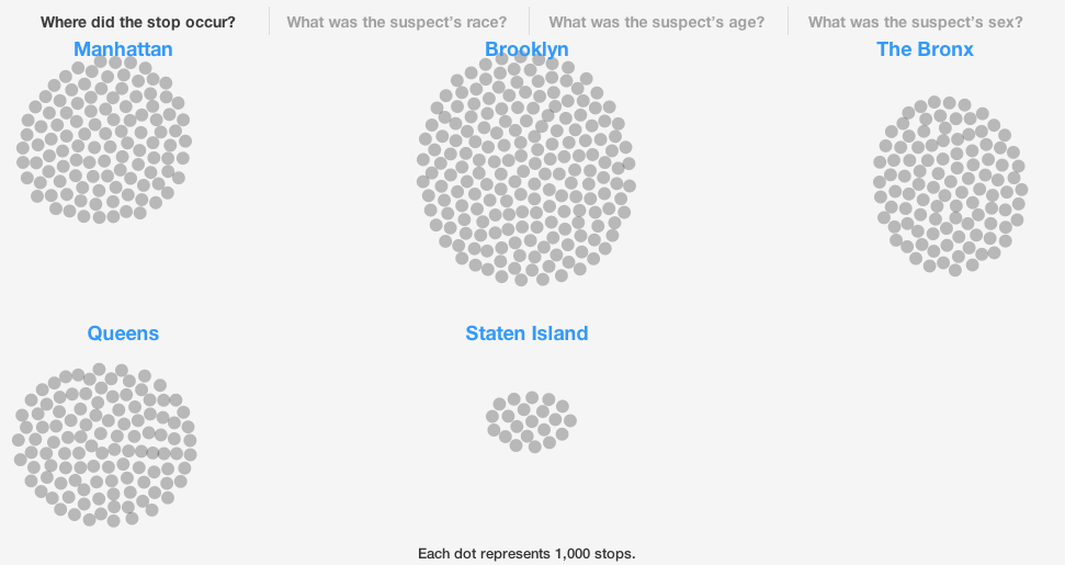
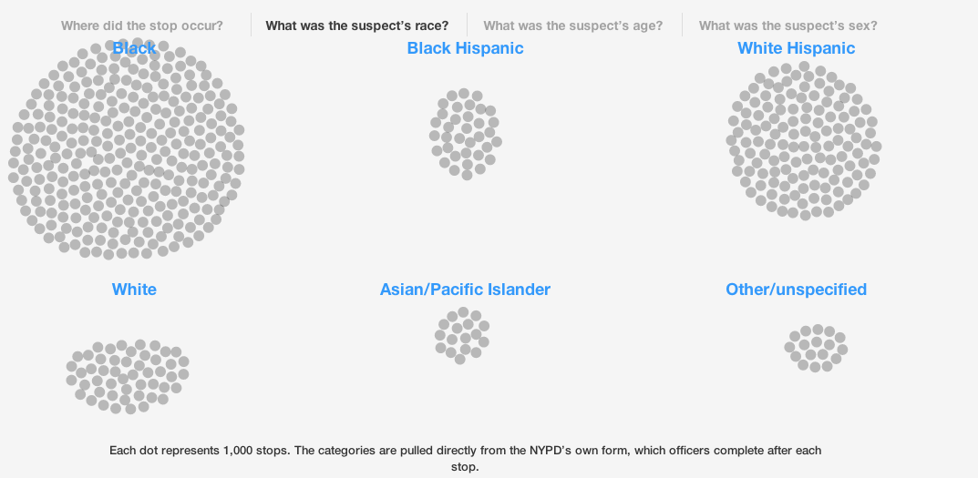
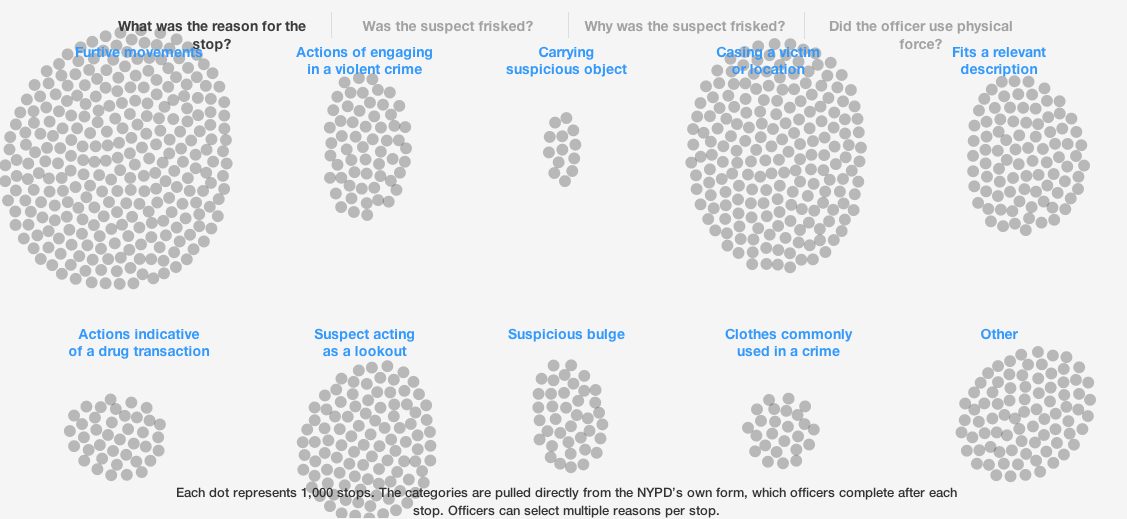
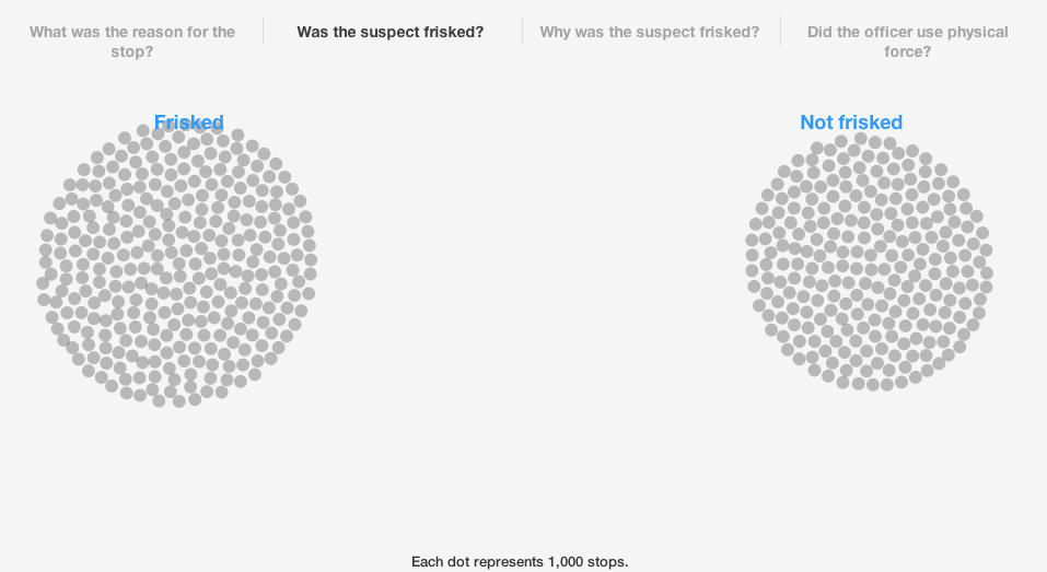
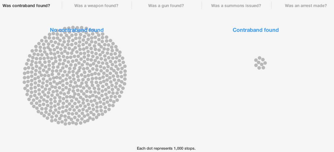
The online magazine BKLYNR, which features quality journalism about Brooklyn, has also used data visualization to focus attention on the issue of stop-and-frisk.  In their piece, All The Stops they chart the “more than 530,000 stops that occurred in 2012, [to] reveal who is being stopped, why they’re being stopped, and what, if anything, is being found by the police as a result.”  BLKYNR’s visualization of stop-and-frisk allows for a strong understanding of the volume and effects of this policing tactic and engages audiences through questions and answers such as:

Where did the stop occur? 

Screen Shot 2013-10-31 at 12.40.21 PM

What was the suspect’s race?

Screen Shot 2013-10-31 at 12.41.14 PM

What was the reason for the stop? 

Screen Shot 2013-10-31 at 12.42.57 PM

Was the suspect frisked?

Screen Shot 2013-10-31 at 12.43.50 PM

Was contrabound found?

Screen Shot 2013-10-31 at 12.44.39 PM

Was an arrest made?

Screen Shot 2013-10-31 at 12.45.29 PM

Take Action 
Are you interested in making your own data visualization? There are many tools that journalists, academics, and activists can use. As a way to get started, take a look at this list of the Top 20 Data Visualization Tools.

* * *

This post is part of the Monthly Social Justice Topic Series on stop-and-friskIf you have any questions, research that you would like to share related to Stop-and-Frisk or are interested in being interviewed for the series, please contact Morgane Richardson at justpublics365@gmail.com with the subject line, “Stop-and-Frisk Series.”


Data Visualization of Activist Lesbian-Queer Histories

lha org records - all copy

Jen Jack Gieseking CC BY-NC-SA jgieseking.org

Activist history is especially important to lesbian and queer women because it is this marginalized group’s primary public, visible history. Data visualization tools can help us understand that history.

My research looks at the lives, spaces, and experiences of justice and injustice of lesbians and queer women in New York City from 1983 to 2008, a span of time marked at the beginning by AIDS activism toward the end by the popular cable tv show “The L Word” and asks: did these women’s lives get better? If so, how important was activism to this? Part of this answer is in the archival data of lesbian and queer women’s activism.

Originally part of my dissertation research and now a part of the series of books I am writing, I knew the activist and organizational history was much more complex because I surveyed the complete collection of 2,300+ organizational records at the Lesbian Herstory Archives (LHA). Out of that, I created a data visualization (see left) of all NYC-based organizational records spanning my period of study, 1983-2008 (n = 381).

My choice of data visualization as a tool was inspired by a conundrum: how do you make sense of 25 years of radical and mundane social, sexual, political, and cultural history in nearly 2,000 detailed nodes of information spanning a word to a paragraph to a few pages each?

The minutiae of politics, places, and people’s everyday lives was available in the stories of lesbian and queer organizational records and publications in ways that weren’t accessible through other research methods, like the focus group interviews I used in another part of the research.  Rather than the individual stories that emerged from personal interviews, an entire chronological history of lesbian-queer life could unfold in the quantitative study of these places, spaces, and people.

This is where data visualization came in. I had read Nathan Yau’s utterly inspiring Visualize This when it came out but never dug in to data visualization and didn’t know how it might be useful for my research.

Attending the MediaCamp workshop on Data Visualization with Amanda Hickman was a breakthrough for me.  In that workshop, I realized that the only way my data from the LHA would be revealing and fun was through data visualization. Using the data visualization tools HighChartsJS and jsFiddle, in just a few hours I saw the way my data shifted from 2D to a 3D platform for the public. These tools made my data about activist lesbian and queer women suddenly interactive and engaging in ways I had not imagined.

Here’s an example. One of the key takeaways from my focus groups with lesbians and queer women who came out between 1983 and 2008 was the persistence experience of loss and mourning of key lesbian-queer places, namely neighborhoods and bars, as well as bookstores and other community spaces. At the same time, many women, especially those who had come out in the 1980s and 1990s generations, lived with an expectation that one just created the organization or space they required, often through activism or socializing. When we turn to the actual numbers of lesbian and queer organizations in terms of their totals and their patterns of opening and closing, there is more to these shifts.

The generational social and political shifts explain a great deal about the growth of these organizations and this helps to frame my reading of this visualization. The number of activist lesbian-queer organizations rises significantly in the 1980s and early 1990s, as we can see in the graph above, both in terms of the total and those founded. Many of these groups were inspired by the continued to response to issues facing women and the successes of the feminist movement, as well as the burgeoning and powerful response to the AIDS crisis and the inspiration for change instilled by many movements for action.

There are also outcomes for organizing in the 1980s and 1990s that this graph also illustrates. Prior to this time period, there were very few if any social support services especially for LGBTQ people at the state or national level.  During rhis period of activism there was a pattern of growth in the non-profit industrial complex as a primary method of social support for LGBTQ people in the US.  In the 2000s, the number of these groups plateaued.  This matches the ways non-profit organizations have become the official brokers of what remains of the US welfare state as it relates to LGBTQ concerns.

The LHA records have more to say on a range of issues relevant to lesbian and queer women. In a series of posts on my site, I’ll be posting a set of interactive data visualizations from my analysis of the 381 NYC-based records available at the LHA of lesbian and/or queer organizations spanning 25 years (1983-2008). I invite you to join me in exploring the meaning behind an often invisibilized activist lesbian-queer past.

~ Jen Jack Gieseking, PhD is the Project Manager of JustPublics@365. She is a cultural geographer and environmental psychologist. Her website is jgieseking.org.

Using Big Data to Improve Public Health

Big data holds the promise for helping solve big problems and improve health. In their book Big Data, authors Kenneth Cukier and Viktor Mayer-Schonberger describe how tracking flu symptoms via Google searches is much faster than the traditional methods used by the Centers for Disease Control (CDC).

The problem with traditional data collection on health such as those at the CDC is that they can be time-consuming and cumbersome.  A key reporting mechanism that the CDC uses is from doctors, who are, in turn, reporting on the patients they’ve seen in their office consultations.  Relying on these reports builds in a delay of a week, sometimes longer, into the data the CDC is collecting.

Big data, the data that’s collected already in a variety of ways, can be mined, analyzed, and curated in ways that can help improve health of whole populations, not just individuals.  As with the example of the Google flutrends, there is some hope for addressing asthma through the use of big data.

Making progress in the treatment of asthma requires data outside of the self-reported information from asthma sufferers that doctors generally rely on. The new Asthmapolis may offer part of the solution. Asthmapolis seeks to eliminate the “inability to collect information about where and when people develop symptoms.” Asthmapolis uses inhaler sensors, mobile applications, advanced analytics – in other words, big data –  to help physicians identify those patients who need help controlling the disease before exacerbation.

How does this research impact the public?  In Louisville, Kentucky, for example, a city with particularly difficult air quality conditions for those with breathing disorders, Asthmapolis teamed up with health officials to collect data by sensor in the inhalers of project participants. This helps Asthmapolis and city leaders understand when and where people with asthma develop symptoms, in turn identifying community-wide asthma triggers that can be eliminated. This means that using big data has the potential to improve health by monitoring individual asthma attacks  as well as creating population-level changes in environmental policies that may trigger asthma.

Some policy makers and physicians have raised the concern that the nation’s most pressing health epidemics are in fact appallingly low-tech, and that it’s local reforms and relationships, not high-tech solutions that are needed. The brains behind Asthmapolis are trying to fuse the two approaches together; the on-the-ground experiences of asthma sufferers, the technology that allows for location-specific data, lightweight sensors, and continual monitoring, with a continued conversation about enacting real change on the municipal level.

As promising as Google flutrends and Asthmapolis are, big data raises big questions about that information gets used.  Do we have faith in our institutions to create change that will improve health for everyone from the enormous amounts of data that such a project will gather?  Or, will political action still be necessary to compel leaders to do the right thing?  Only time will tell.