Tag Archives: data advocacy

Mapping Social Inequities: Using Evernote for Evidence-Gathering

 Mapping Social Inequities

Although my post last week discussed how data visualizations such as maps could be used to promote social change, often overlooked are discussions regarding tips and tools for gathering evidence which can be used for mapping social inequities.  Therefore, this post explores how Evernote 5 can be used as a free and powerful evidence-gathering digital tool for highlighting social inequities. Evernote 5 is available for free for both Mac and recently released for Windows.

In an interview with Eric Cadora from The Justice Mapping Center, for our From Punishment To Public Health (P2PH) Social Justice Topic Series, he showcases how maps can expose the cross-sections between public health and public safety in vulnerable communities.  Specifically, Cadora finds that populations which often experience chronic ill-health are often also the same populations which are in and out of prison and jail.  Other studies have found a correlation between crime and chronic disease, which are often reinforced by high levels of health illiteracy and disparity (The Poverty Clinic, Paul Tough).

As the worlds of public health and public safety continue to merge, this presents valuable opportunities for academics and social justice advocates to document and gather evidence of how these dynamics play out within their communities.

I decided to begin my own evidence-gathering efforts as I went about my travels throughout New York City.  For my exercise, I was interested in gathering evidence on the types and number of community health clinics that existed in high crime NYC neighborhoods.

In order to do this, I downloaded both the App and web version of Evernote 5 (App versions are available for Iphones and Android).

For those not familiar, Evernote is a note-taking and clipping application that lets you save all kinds of bits of information into various project-oriented “notebooks.” Academics have been using Evernote to write dissertations or articles, conduct classes and research, etc.  However, less is known about how it can be used for evidence and information-gathering.

FOR STARTERS – Aspects of Evernote that make it an especially useful tool for evidence-gathering are:

  • Ability to go almost completely paperless! Digitize your physical notes and back them up in the cloud. This can come especially handy when ensuring the protection of sensitive documents and information.
  • Allows you to collect an array of multi-media and documents and keep it neatly organized and searchable: You can further use Evernote’s tagging feature and then take advantage of their amazing search and filtering capabilities. In Evernote, you can search by: keywords, tags, dates, or note types (such as images, audio, PDF, etc.). Evernote’s optical character recognition capability (OCR) also converts images of letters/numbers into searchable text (for example as in words from a photo, scanned document, or PDF).
  • Use your personal Evernote email address @m.evernote.com: This allows you to email notes to specific project notebooks and keep your evidence well-organized.
  • Collaborate and share your work with others: Create a link to a private shared workspace and send it to everyone involved. At the same time, you can make any of your notebooks publics which can then be posted on a webpage or included in an email.
  • Dictate your thoughts, ideas or conversations if you have a smart mobile device. You can then use Voice2Note to then convert audio notes into text to make them easily searchable. Simply connect your Evernote account and the first 30 seconds of your notes will be transcribed.
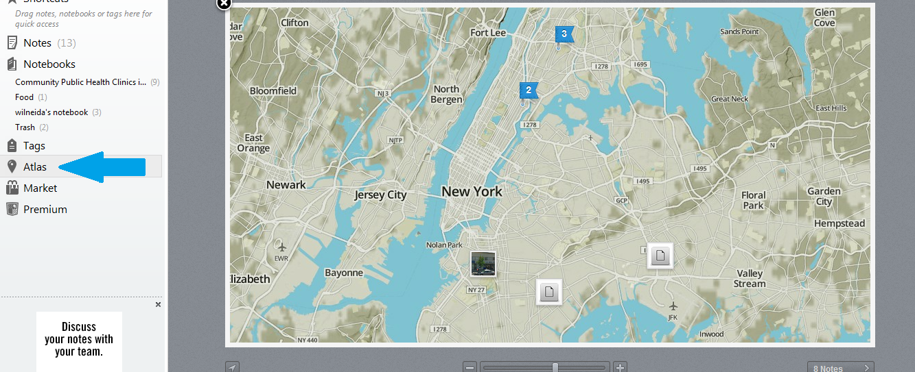
  • Use the Atlas feature to capture GPS information along with the notes you take (now available in Evernote 5): For example, you can use this if you want to capture the specific location of an event, where evidence was found or collected, image taken, etc.
  • This in return allows you to start visualizing geo-specific trends that may either highlight gaps in your evidence-gathering or important issues and patterns that warrant further exploration.  Most importantly, it allows you to start outlining the key trends for your mapping visualization.
  • The Evernote app allows you to effortlessly capture evidence during your day-to-day activities: This means that you will always be prepared to quickly capture, geo-code, and catalog a valuable piece of information for future reference.

Setting Up Your Evernote Evidence-Gathering Notebook

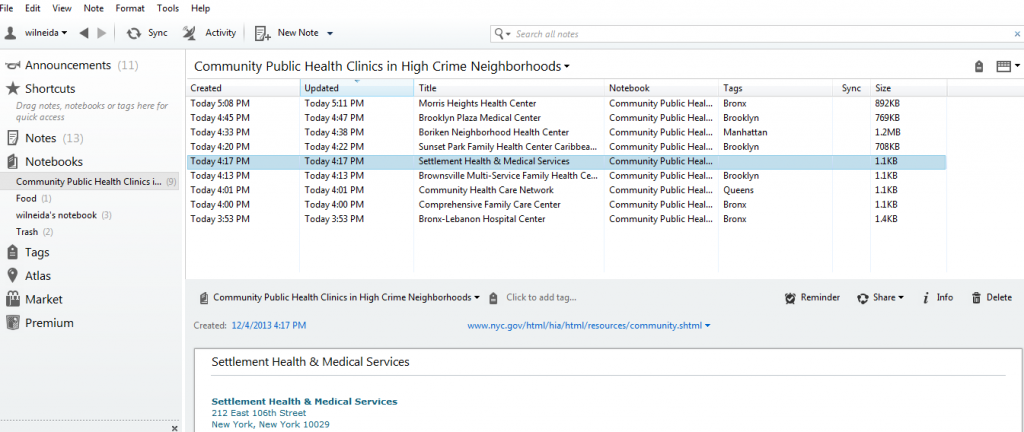
Using the web version of Evernote 5, I create a notebook called, Community Public Health Clinics in High Crime Neighborhoods.  Once I created this notebook, I was then able to upload evidence of community public health clinics in several forms, notes, images, audio, or video.

evernote 5

My evidence-gathering notebook where I can upload notes, images, audio, or video and geo-code them.

evernote evidence gathering                    
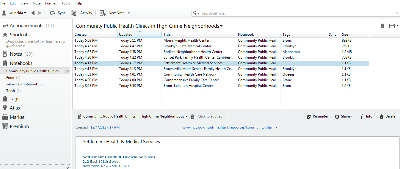
Here you can see images of the clinics I have uploaded for future reference. 


Finally, Evernote 5’s Atlas feature allows me to see my notes, images, and pictures in map view.  This map views helps (a) to ensure that you are covering all the locations/areas that you want to focus on and (b) helps ensure the accuracy of the location for each piece of evidence collected.  

evernote 3Here you can see images and notes regarding community health clinics which I have uploaded for future reference.

Final Thoughts

Moving beyond map visualizations, there are many contexts and ways to use evidence for promoting social justice.  Consider, these real-life examples from the New Tactics in Human Rights website of the types of social justice contexts which Evernote’s features could be most useful for:

Documenting cases of injustices that can be used as legal documentation in courts: See example of collaboration between a human rights group and local monitoring teams in Yemen.

For coordinating and gathering info during participatory research: Read about how groups and individuals in Mozambique launched a collaborative effort to train locals on data gathering which also gave local NGOs a concrete research instrument they could use for future endeavors.
Using technology to share and gather information on environmental hazards: This is where Evernote’s mapping/Atlas feature can really come in! Read about how Environmental Defense used technology to categorize information about harmful environmental hazards such as air pollutants, toxic chemicals, etc.
Collect and preserve community stories and testimonies: Read about how scholars trained in reading and interpreting the texts worked with locals in Tibet to enter ancient text into an electronic database.

***

This post is part of the Monthly Social Justice Topic Series on From Punishment To Public Health (P2PH). If you have any questions, research that you would like to share related to P2PH or are interested in being interviewed for the series, please contact Morgane Richardson at justpublics365@gmail.com with the subject line, “P2PH Series.”

Data Advocacy: Visualizations for Promoting Change

The report, Blueprint for a Public Health and Safety Approach to Drug Policy, by the Drug Policy Alliance and The New York Academy of Medicine provides a comprehensive set of recommendations for fixing a broken drug policy that is a “bifurcation between two different and often contradictory approaches – one which treats drug use as a crime and the other view, as a chronic relapsing health or behavioral condition.”

Anyone who has spent time working in human services knows that multiple programs (whether offered through community groups, nonprofits, churches, or government agencies at the local, state, and federal level), own a piece of the puzzle when it comes to helping and healing people and families. In the case of substance abuse treatment, there’s a myriad of actors in health/mental health, schools, substance abuse services, law enforcement, corrections, and departments of children and families who all need to be coordinating and working together. However, as the Blueprint highlights, this does not always happen. Rather, “without a united framework and better coordination, these actors and agencies often work at cross-purposes” (Blueprint Report, pg. 4). The themes of coordination, overlapping, and cross-purposes appear throughout the report, and these are what I highlight in the discussion of data visualization here.

Provoking Change: Your Data Can Tell a Story

Data visualizations can tell a clear concise story about why an issue is important and why change is needed. So, they are ideal tools for fostering greater awareness and supporting advocacy efforts.

Data visualizations are often associated with their popular counterparts, information graphics (aka infographics).  Although both allow you to use and transform your data into a compelling presentation or powerful story, there is a key difference between the two. While data visualizations take complex sets of data and display them in a graphical interface, like a chart or map, so users can gain insight into patterns and trends, infographics use data visualizations in concert with text and other tactics to tell a story, make a point or communicate a concept (“Data Visualization and Infographics: Using Data to Tell Your Story”).

Visualizations are especially effective for data advocacy because they:

  • Make your message more compelling: Let’s face it, visualizations are simply much better at stimulating thought and conversation than more traditional textual or numerical data.
  • Allow you to reach a wider and more diverse audience:  The reason for this is that visualizations allow you to convey complex data and abstract information in an easily digestible and shareable formats.
  • Visualize information, systems, networks and flows which can be valuable for highlighting social problems and need for policy changes.
  • Illustrate timelines and relationships that can help readers put the dots together in understanding a problem (“Data Visualization and Infographics: Using Data to Tell Your Story”).

Visualizing New York Drug Policy

This next section outlines step-by-step instructions to create your own data visualization. I searched NYC Open Data and Open Data NY Gov for the best data set that would help me highlight the idea of overlapping human services agencies that work on substance abuse issues in New York State. The best data set I found was one which provided information on Local Mental Health Program in New York State, broken by county and program subcategory.

Because of the geographic nature of this data, I opted to create a heat map.  Because I was also interested seeing the distribution of the types of substance abuse mental health programs in New York according to county, I found a histogram to be useful as well.  I then selected two free and easy-to-use data visualizations tools: Many Eyes and Tableau Public.

This brings me to the first lesson in creating data visualizations:

 (1) Don’t be seduced by the exciting and cool visualization tools: In creating visualizations for advocacy and social change, it’s critical to keep in mind your objective and to avoid visualizations which just offer eye-candy.   You want the reader to be attracted to your message, not your methodology or the cool visual tools you used.  So, ask yourself if you want your data to provide (a) description, (b) exploration, (c) tabulation, or (d) decoration (see Tufte’s “The Visual Display of Quantitative Information.” )   There is a lot you can accomplish visually with basic free tools such as the two that I used.  However, for a full list of all data visualizations tool available visit Bamboo DiRT.

(2) Prep your data: Every great visualization begins with a coherent and well-organized data set.  As a result, it’s important to clean your data and only leave the most essential variables organized in the best possible format to reveal the main relationships that you want to highlight between your variables.

Two free tools which can help you clean and prep  your data for visualization are:

For my data set of Local Mental Health Program in New York State, I filtered the data according to those that provided substance abuse counseling and then I created a frequency distribution with a pivot table.  Pivot tables (also called contingency tables and cross tabulation tables) are a powerful means of data visualization and data summarization.  You can download my pivot table here if you would like to experiment with it.

Mental Health Program Sub-Categories

Assertive Community Treatment Care Coordination
Clinic Treatment Comprehensive Psychiatric
Emergency Continuing Day Treatment
Crisis Day Treatment Education Forensics
General Hospital Psychiatric IP Unit General Support
Intensive Psychiatric Rehabilitation
Partial Hospitalization Personalized Recovery-Oriented Services
Private Psychiatric Hospital Residential Treatment Facility
Self-Help State Psychiatric Hospital
Support Program Treatment Program
Unlicensed Housing Vocational

Many Eyes provides information on how to format your data according to the visualization that you chose.

Pivot Table into Many Eyes

After creating a pivot table of my data which adds up the total number of program subcategories according to county in New York, I am then able to upload the data onto Many Eyes.

 finalizing pivot data

After uploading the data, I compared how the pivot data appears on Many Eyes versus my spreadsheet to ensure data accuracy.

To see the final interactive heat map designed on Many Eyes click on the image below:

 Many Eyes Heat Map

 This heat map showcases the density of mental health programs that deal with substance abuse in New York State.  The heat map is interactive because the key allows you to select different sub-program categories to see which counties have the most programs and which don’t.  

(3) Ensure Content Focus: The best visualizations are transparent about the data used.  As a result, in designing my interactive heat map, I also included drop down menus for people to see what types of substance abuse programs were available in which counties and which were not.  As a result, I wanted to keep the focus on the content of the data and not necessarily on the very cool heat map that I just made!

(4) Reveal the data at several levels of detail, from a broad overview to the fine structure:  Tableau Public offers much more customization features which allow you to showcase your data on many different levels.

Tableau dashboard

Tableau dashboard features more options for organizing your data and highlighting specific trends geographically broadly or on a more granular level.  

(5) Avoid Distorting the Data: A good visualization should always showcase the data honestly.  As a result, things such as pie graphs and charts are frowned upon because they of their distortion of the data and lack of clarity.  This is what’s often deemed as avoiding “chart junk” (Tufte).

For example, my pivot table histogram below does a better visual picture of highlighting consistencies and gaps in mental health services across program sub-categories and counties than the map using pie charts.  

pivot table chart

Pivot table histogram highlighting the distribution of each mental health program sub category by counties.  As a result, this visual quickly shows you the overlaps as well as gap in services.

Now look at my same pivot table data but this time using pie charts rather than heat map or histogram.  Although, somewhat visually appealing, the pie charts do not shows how the programs each make up a whole, thereby, disguising the potential problems of overlap.

piegraphs

Becoming a Data Visualization Expert: Final Tips and Resources

 (6) Make it memorable:  Studies have found that memorability alone can enhance the effectiveness of visualizations.   A recent study, which is the most comprehensive study of visualizations to date, found that visualizations that were most memorable had:

  • Human recognizable objects”, these were images with photographs, body parts, and icons–things that people regularly encounter in their daily lives.
  • Effective use of color, specifically, visualizations with more than six colors were much more memorable than those with only a few colors or a black-and-white gradient.
  • Visual density, meaning that visuals that had a lot going on were more memorable than minimalist approaches.

For inspiration on data visualizations that promote advocacy and social change visit: